We Rescue
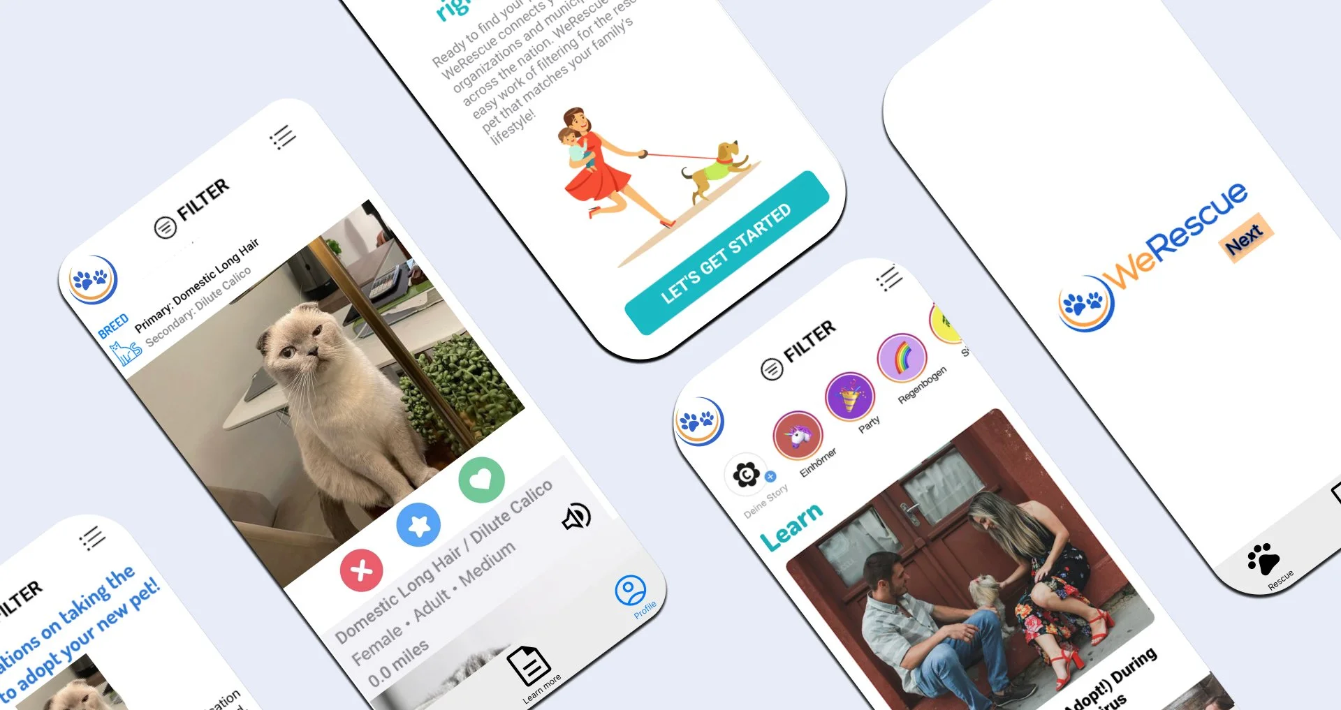
WeRescue is an app that helps people find their companion of their lives at a local pet shelter.
We Rescue App
Project Overview: Created and developed a case study to effectively communicate WeRescue’s user experiences improvement areas.
Problem: Failure to convey available homeless pet’s for users and confusing layout lead to an unpleasant adopting experience.
Solution: Enable easier access to key information, redesign the user flow and improve UX/UI design.
Objective: Help people adopt pets by designing an app for the We Rescue App.
Role: UX designer leading the app and responsive website design from conception to delivery.
Research Methods: Surveys, Competitive Analysis.
Stakeholders: We Rescue core design team.
Tools: Adobe XD, Figma.
Collaborators: Emily De Camilla. (UX Writer) , Joseph J. (UX Designer), Sebastian E. (UX Researcher)
Deliverables: User journey, wireframes, interview scripts, Competitive Research, Interaction Design, UX Wireframes, High and Low Prototyping.
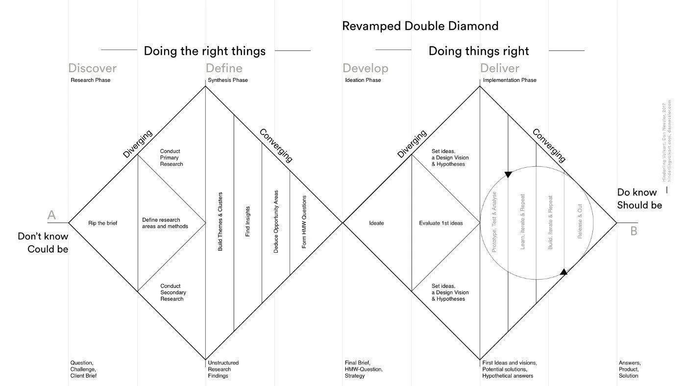
I followed UX design Double Diamond structured to tackle the challenges of this project.
PART ONE
EMPATHIZE
RESEARCH
In the first stage of the project, we were lacking understanding of people's wants, needs, or expectations. so there were three key questions that we wanted to be answered at the beginning of the project
Current frustrations and pain points?
What did they really want?
What did they really need?
So then we dive into an intensive 2-week research sprint to help us understand:
What was the current product offering that the industry was providing to users?
11+ user interviews.
Investigated forums,reddit, and FB groups.
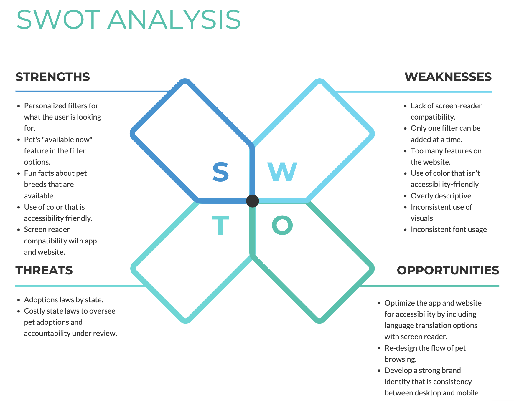
Mapped out a competitor and SWOT analysis.
Some of the insights from the competitive analysis I discovered included:
Users wanted to know how nearby homeless pets were to them.
Users wanted to be able to make that extra step to scheduling a meet-up.
Users were curious about the background of the pet, how was their history? Were they from a hostile background, or how did they end up in the shelter.
PART TWO
CONCEPTUALISE
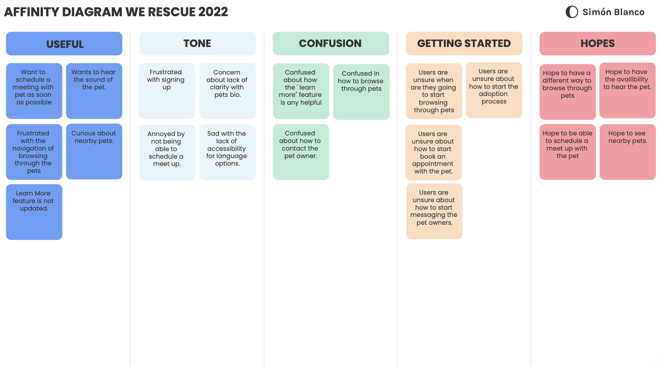
Overwhelmed with insights, we needed to start prioritizing to form a strategy.
Understand key pain points, wants and needs.
Classify all insights gathered.
Present out synthesis to stakeholders
Jumped into secondary research to form our product strategy and experience.
Created affinity maps
Prioritized customer pain points, wants and needs.
Presented the insights to stakeholders
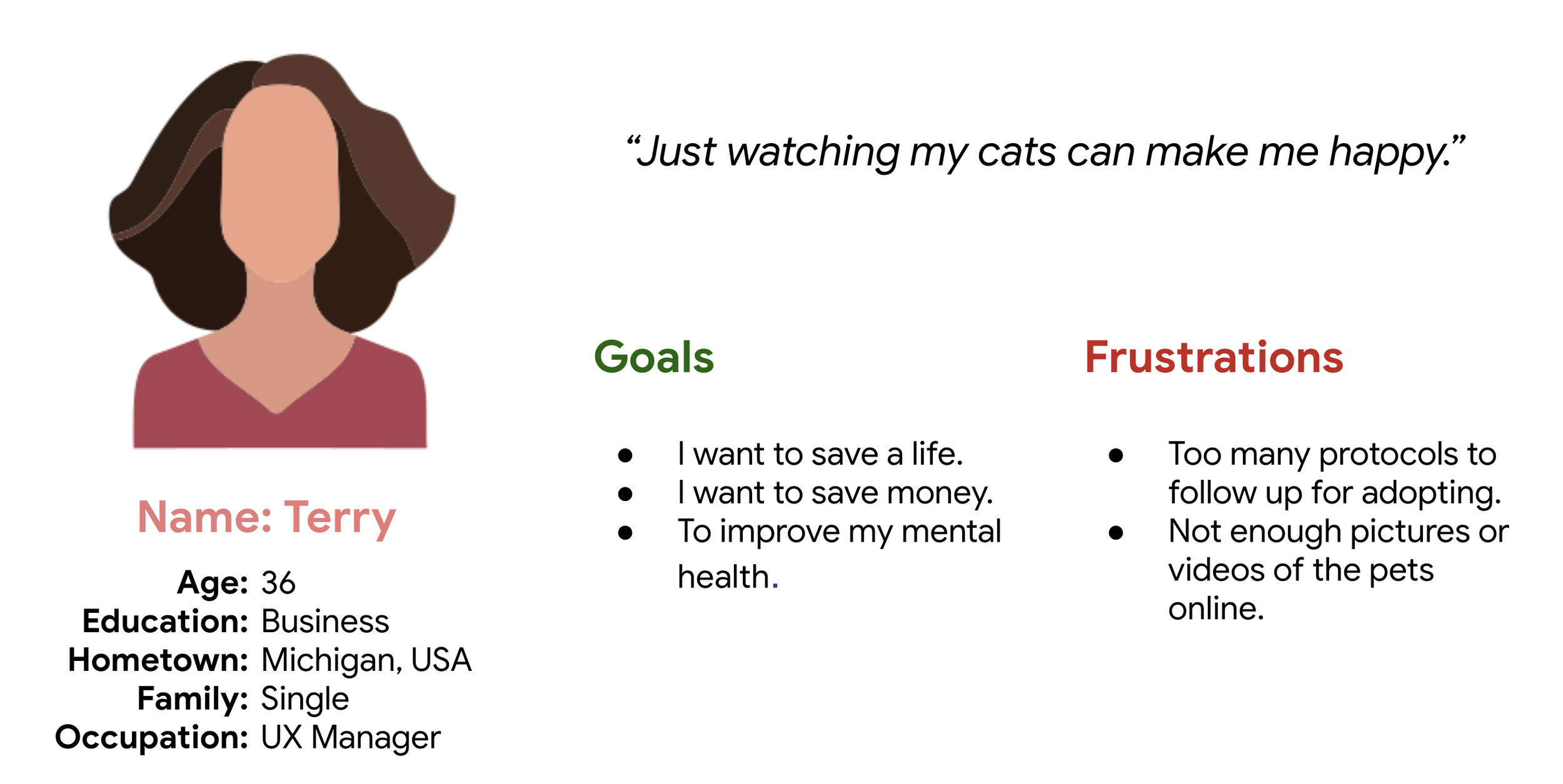
USER PERSONA
Understanding the user by personifying interview insights
Based on the themes derived from the interviews, I felt that I had enough information to construct a user persona. Terry, the subject of my persona, brings to life the most pertinent pain points, behaviors, and motivations from the interviews I conducted.
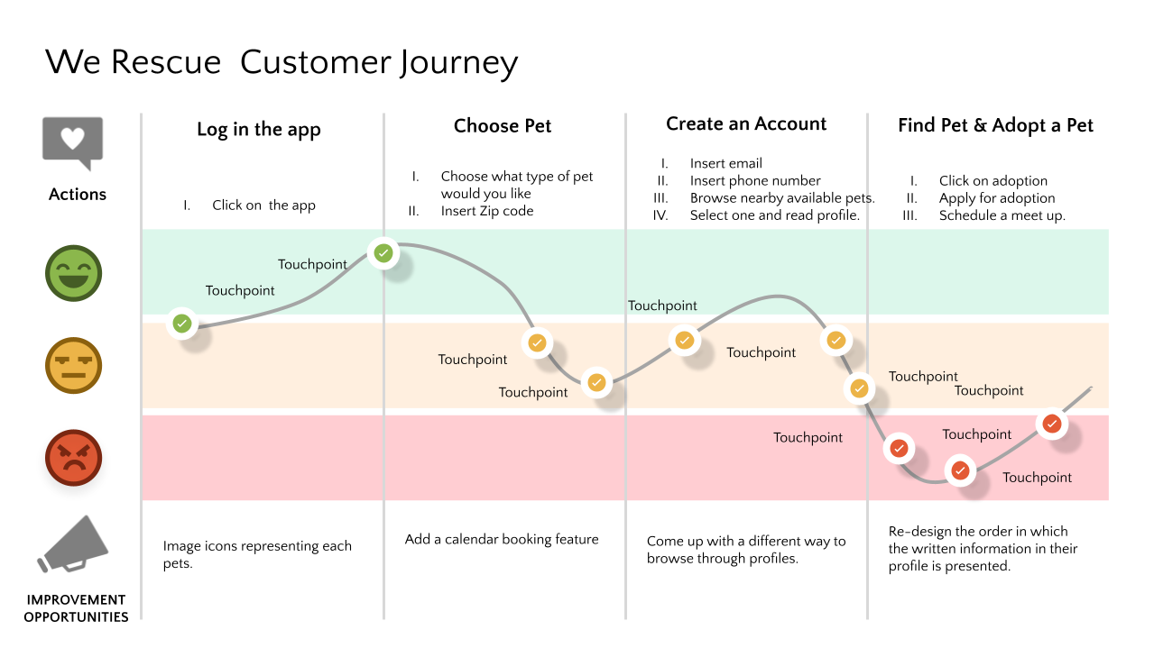
EXPERIENCE MAP
Empathizing with the user through an experience map to understand what Terry is seeing, thinking, and feeling throughout the journey of finding and using a pet adoption app, I created an experience map. The reason why I decided to create an experience map was so I could identify opportunities to ease Terry’s frustrations.
PART THREE
DESIGN
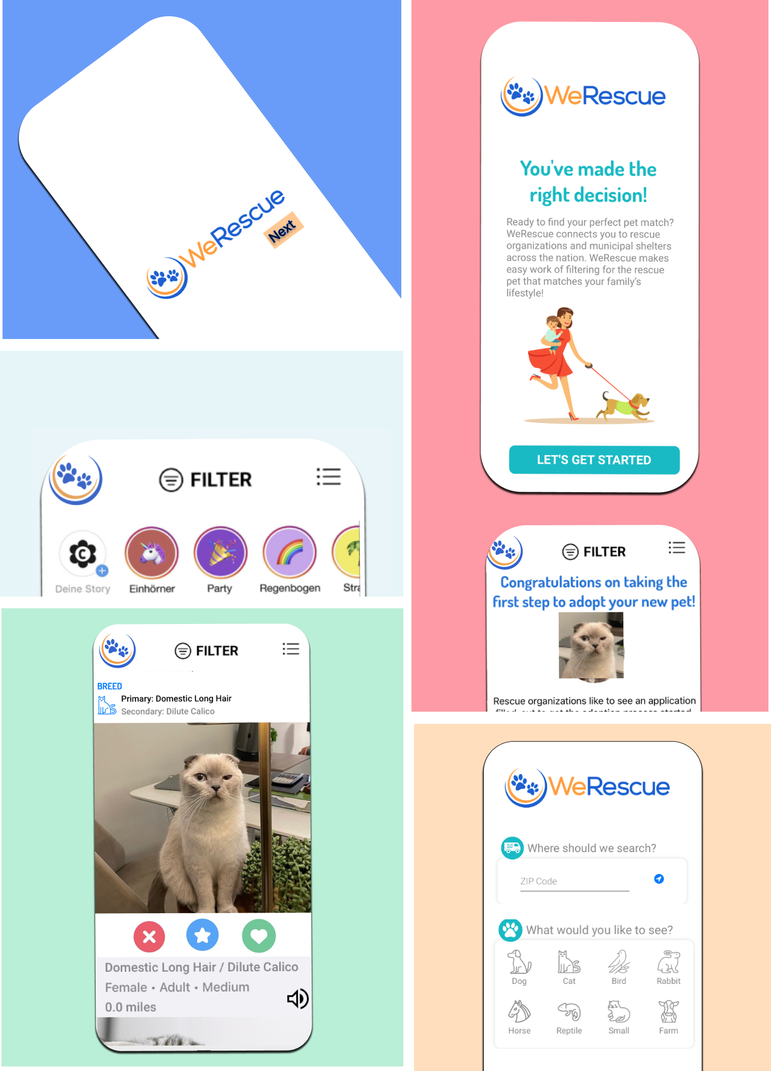
WIREFRAMES:
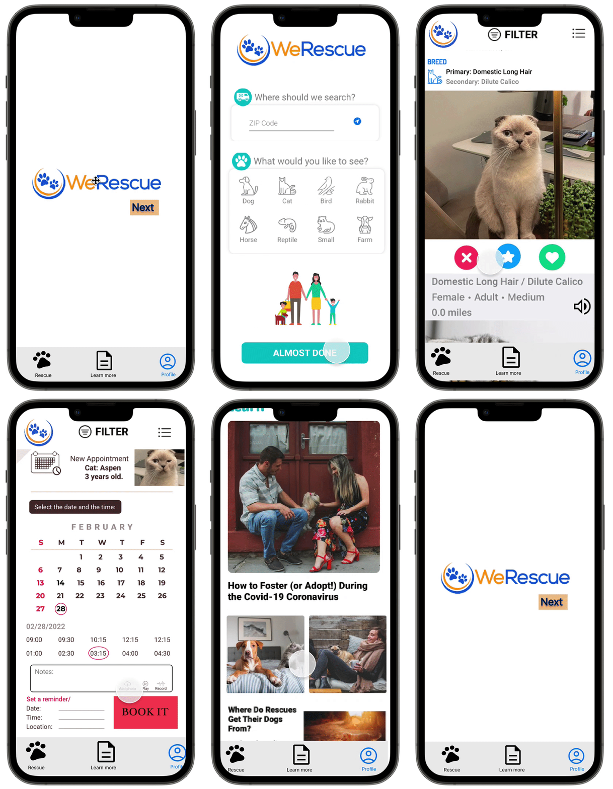
After ideating and drafting some paper wireframes, I created the initial designs for the We Rescue app. These designs focus on delivering personalized guidance to users to help and support their potential pets.
We were on a very tight deadline and developers needed to start building soon.
Should we re-design a mobile first?
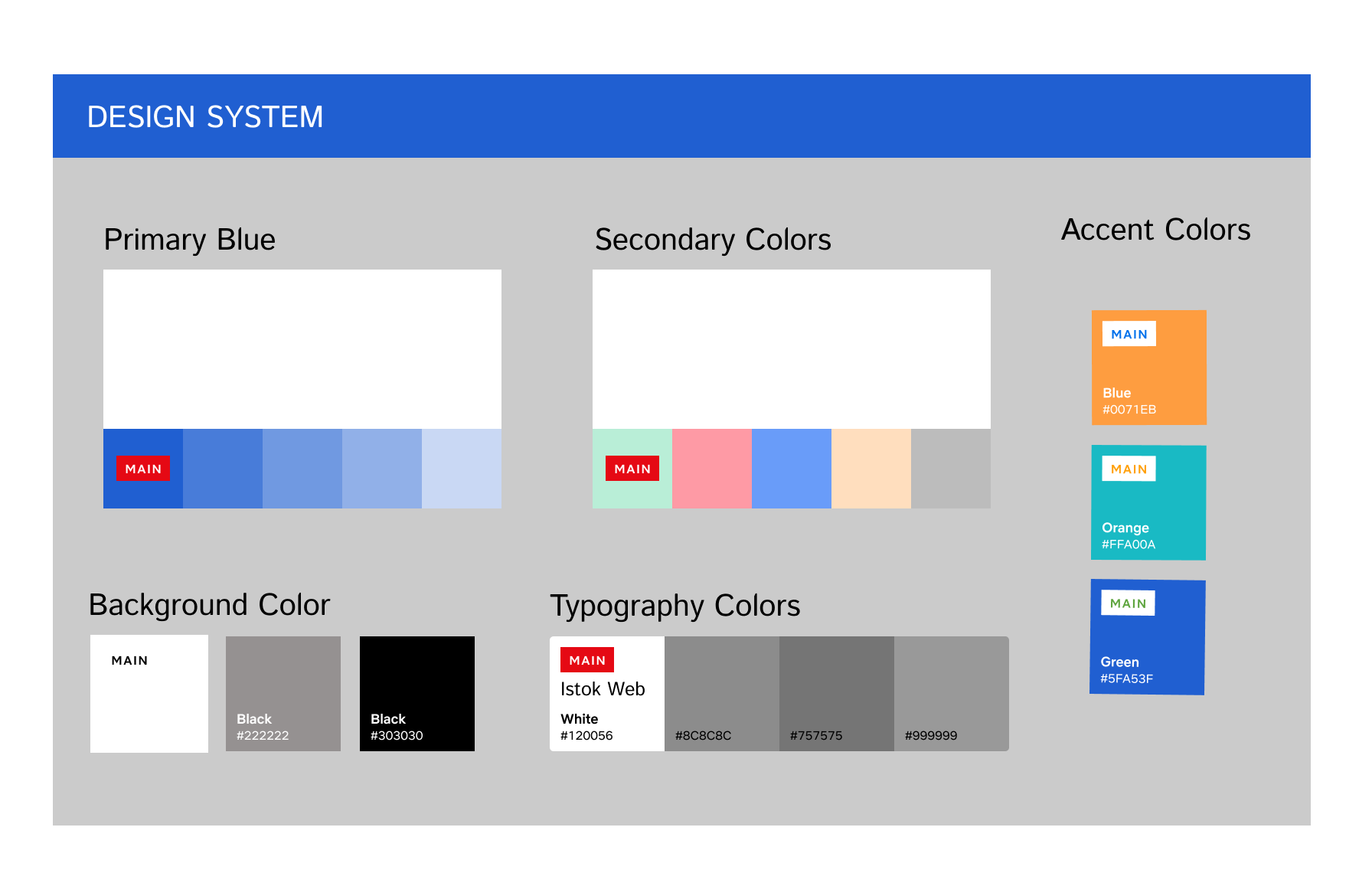
Did we need a design system right now?
What was our visual design language?
Once we answered the burning questions, we commenced design right away.
Request the design system as a priority.
Moved forward with a mobile-first approach.
Focus on homepage and funnel first.
PART FOUR
OUTCOMES
We successfully launched 3 months later and celebrated with the entire We Rescue team!
780 new pet sign-ups.
Sponsorship by Purina.
+30 % conversion rate.
Interactive Prototype


