San Francisco SPCA
SF SPCA is an animal shelter that offers affordable pricing options for the adoption of homeless pets.
San Francisco SPCA Web app
Project Overview: Created and developed a case study to effectively re-design the web app.
Problem: Failure to convey adoption protocols for users and confusing layout lead to an unpleasant adopting experience.
Solution: Enable easier access to key information, redesign the user flow and improve UX/UI design.
Objective: Help people adopt pets by designing an app for the San Francisco SPCA.
Role: UX designer leading the app and responsive website design from conception to delivery.
Research Methods: Usability testing.
Stakeholders: San Francisco SPCA core design team.
Tools: Sketch, Adobe XD, Figma.
Collaborators: Emily De Camilla. (UX Writer) , Joseph J. (UX Designer), Sebastian E. (UX Researcher) .
Deliverables: User journey, wireframes, interview scripts, Competitive Research, Interaction Design, UX Wireframes, High and Low Prototyping.
PART ONE
Understanding the user
User research
Personas
Problem statements
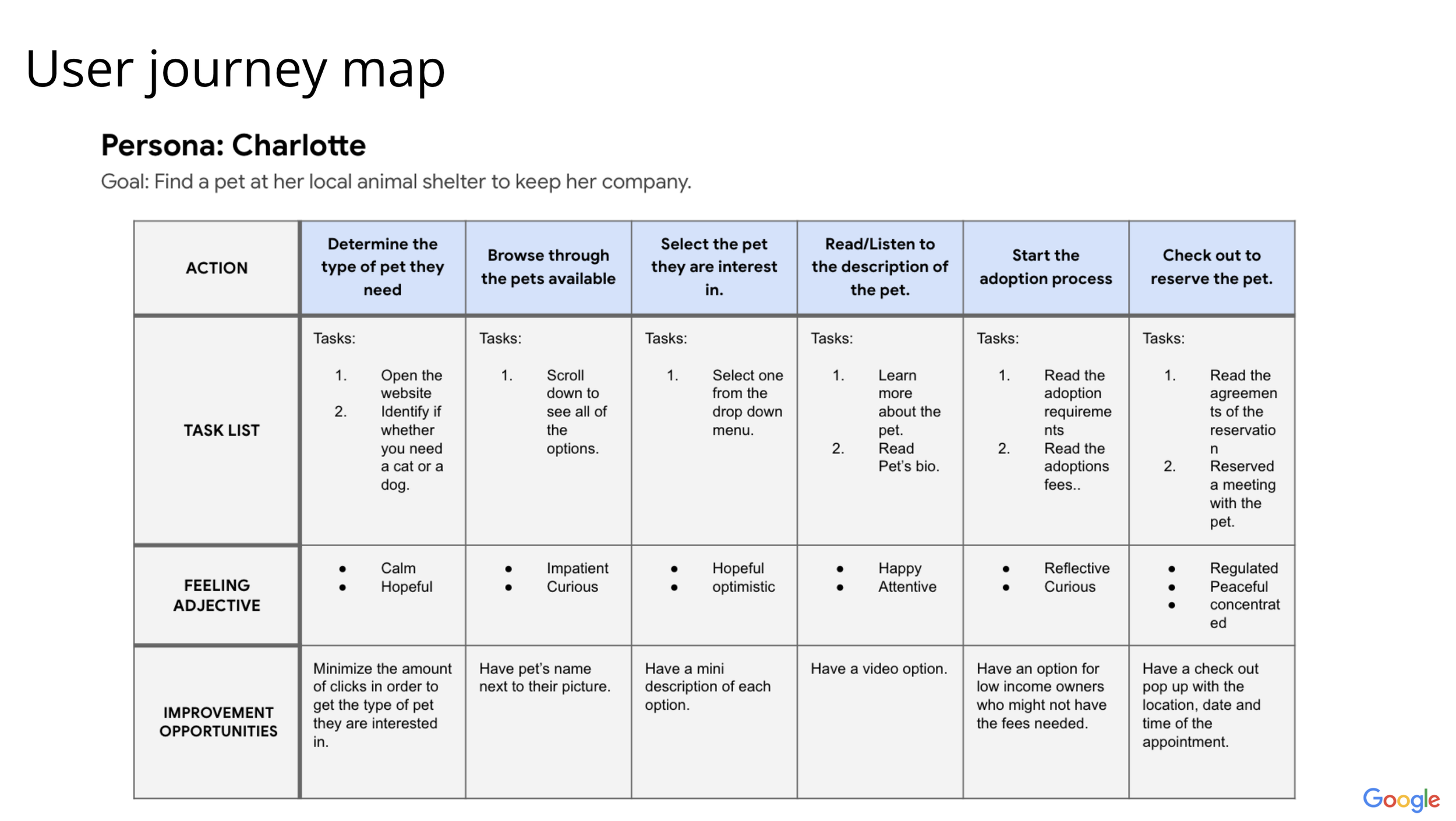
User journey maps
Preliminary Research
I conducted user interviews, which I then turned into empathy maps to understand the target user and their needs better. I discovered that many users treat online animal shelter websites to get to know the pets that are available near them. However, many animal shelter websites are overwhelming and confusing to navigate, which frustrates many users. This caused a normally enjoyable experience to become challenging for them, defeating the purpose of adopting a pet.
Pain points
Animal shelter Website designs are often busy, which results in confusing navigation.
Animal shelter websites don’t provide details such as how far the pet is from the user.
Persona
Charlotte is a UX Recruiter with a busy work schedule. She works at a tech company and on the weekends she likes to play volleyball. Charlotte has trouble regulating her emotions due to her anxiety. Having a responsive website design will make the process of adopting a pet much more convenient for Charlotte.. Charlotte specifically would like for there to be a more convenient way for her to adopt a pet and learn about first pet owner tips and strategies.
User story
As a Working UX Designer who manages a team full-time at Google, I want to adopt a pet that I can share my life with so I can save their life and improve my mental health.
Problem statement
Charlotte is a UX Manager who needs to adopt a pet because she wants to save a life and improve their mental health
PART TWO
Starting the design
Paper wireframes
Digital wireframes
Low-fidelity prototype
Usability studies
Paper wireframes
Next, I sketched out paper wireframes for each screen in my app, keeping the user pain points about navigation, browsing, and checkout flow in mind.
The home screen paper wireframe variations to the right focus on optimizing the browsing experience for users.
Paper wireframe screen size variation(s)
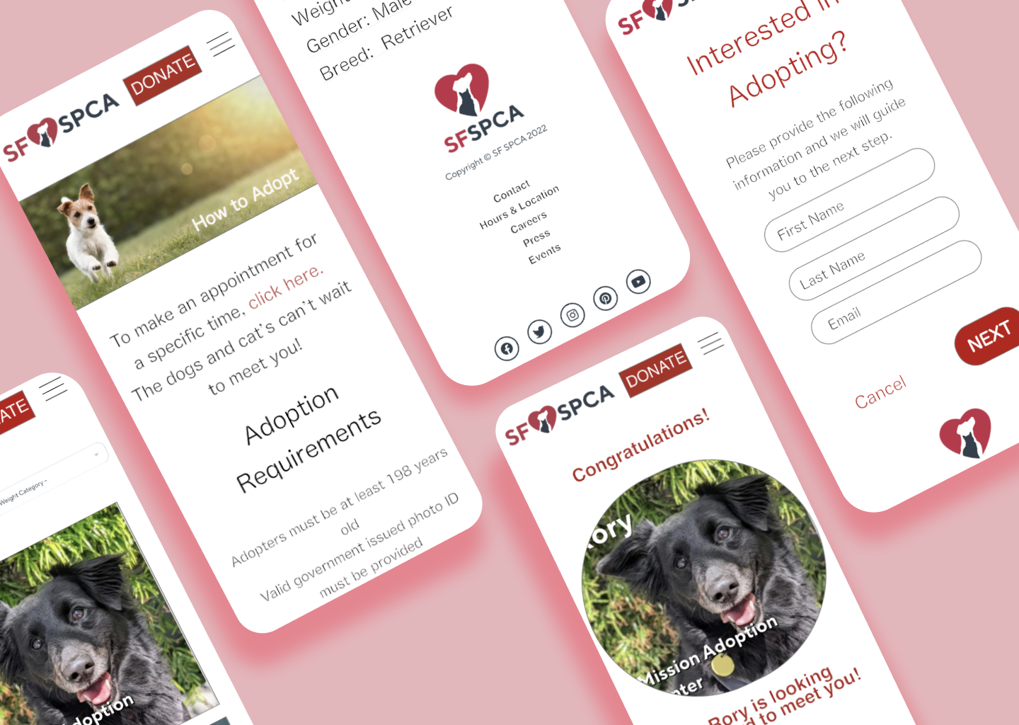
Because SF SPCA customers access the site on a variety of different devices, I started to work on designs for additional screen sizes to make sure the site would be fully responsive. I included a smartphone, ipad and desktop version.
Digital wireframes
Moving from paper to digital wireframes made it easy to understand how the redesign could help address user pain points and improve the user experience.
Prioritizing useful button locations and visual element placement on the home page was a key part of my strategy.
Low-fidelity prototype
To create a low-fidelity prototype, I connected all of the screens involved in the primary user flow of adopting a pet. At this point, I had received feedback on my designs from members of my team about things like placement of buttons and page organization. I made sure to listen to their feedback, and I implemented several suggestions in places that addressed user pain points.
Usability study: parameters
Study type: Unmoderated usability study
Location: United States, remote
Participants: 5 participants
Length: 20-30 minutes
Usability study: findings
Once at the donate screen, users didn’t have a way to edit the quantity of dollars to donate.
Users weren’t able to easily find the pet with filters of age.
During the adoption checkout process, there wasn’t a clear way for users to see their reservations to see their potential pets in person.
PART THREE
Refining the design
Mockups
High-fidelity prototype
Accessibility
Insights
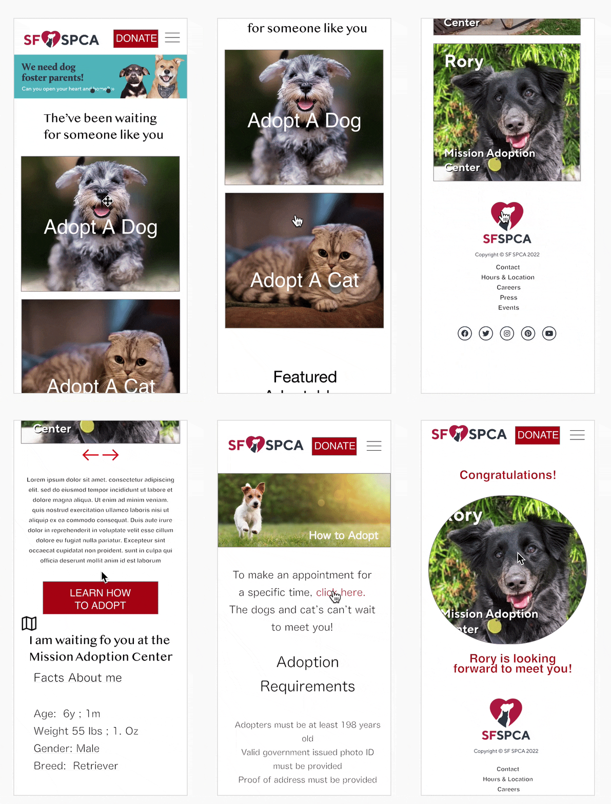
Based on the insights from the usability study, I made changes to improve the site’s adoption of dogs. One of the changes I made was adding the option to “adopt a cat or dog”. This allowed users more freedom to filter the pet without going through the complicated process of surfing through pets that they aren't interested in
To make the reservation flow even easier for users, I added a check box that allowed users to use favorite the pet so they can have easy access in the future.
Mockups: Screen size variations
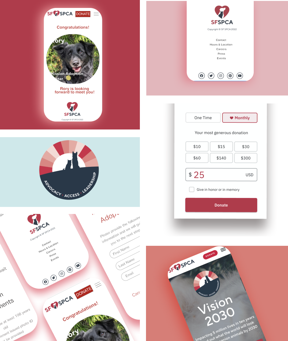
I included considerations for additional screen sizes in my mockups based on my earlier wireframes. Because users want to adopt from a variety of devices, I felt it was important to optimize the browsing experience for a range of device sizes, such as mobile and tablet so users have the smoothest experience possible.
High-fidelity prototype
My hi-fi prototype followed the same user flow as the lo-fi prototype and included the design changes made after the usability study, as well as several changes suggested by members of my team.
Accessibility considerations
I used headings with different-sized text for a clear visual hierarchy.
I used landmarks to help users navigate the site, including users who rely on assistive technologies.
I designed the site with alt text available on each page for smooth screen reader access
PART THREE
Going foward
Takeaways
Next steps
Impact:
Our target users shared that the design was intuitive to navigate through, more engaging with the images, and demonstrated a clear visual hierarchy.
What I learned:
I learned that even a small design change can have a huge impact on the user experience. The most important takeaway for me is to always focus on the real needs of the user when coming up with design ideas and solutions.
Next steps
Conduct follow-up usability testing on the new website.
Identify any additional areas of need and ideate new features.


